Office Space
By: Tracey Gould
What comes to mind when you think of office space? Scenes from the 1999 cult film and pop culture favorite, Office Space, featuring Ron Livingston (Peter Gibbons), likely starts replaying in your mind.
 Worst day of my life
This may seem to demonstrate a flair for the dramatic, but the Gibbons character in Office Space experiences intense dissatisfaction with his employer, work environment, and the infamous TPS Reports — so much so that he claims to his therapist that each day is the worst day of his life. “So I was sitting in my cubicle today, and I realized ever since I started working, every single day of my life has been worse than the day before it.”
Shades of gray-clad partitions, monotone walls and furniture, fixtures, and equipment (FF&E), and a uniform, cubicle farm served as the primary backdrop for this film, mocking mid-90’s white-collar office employees and familiar themes. Gibbons’ feelings aren’t necessarily a direct or exclusive result of the interior design of his workplace. But given the portrayal of his unsettled behavior in the space, it’s definitely a contributor.

Did you get the memo?
Not all office space is created equal, like the TPS Reports in Office Space’s fictional IT firm, INITECH, and thankfully most contemporary office space in 2017 looks nothing like the office environment depicted in the film. In another classic scene, Gibbons takes a drill to his cubicle partition, allowing it to crash to the ground, revealing floor-to-ceiling windows and a great view of the world outside. His satisfying kick-back, reclined pose with his hands behind his head and a big smile on his face says it all: employees need sensible and functional space to be satisfied and productive at work. And by all means — systems furniture shouldn’t unnecessarily block views and natural sunlight.
Life imitating art
Just like Gibbons’ cubicle, the past 20 years of office interior design has seen a notable shift. Liz Wozny, associate vice president with Callison/RTKL, a global architecture, planning and design firm, says office space has evolved. “In the past, the emphasis was on fully closed offices. Then trends shifted toward fully open office spaces. Now what we’re seeing is a mix between the two.”

The jump to conclusions mat
The industry didn’t just naturally get to this point on a naturally cyclical design pendulum. Most end users may assume it’s just the evolution of office space the way fashion trends come and go every 20 years (think platforms and flannels). Like fashion, the built environment does experience similar shifts, adapting to better suit the nature of work, to meet organizational goals, and accommodate technology.
For example, in the first 50 years of the 20th century, rows of corridor offices reigned. In the 1950s, a “Mad Men” environment took shape with closed offices around the perimeter and secretaries and accountants in the open, middle office area. Then in the late 50s, the open office that many environments are based on today became wildly popular with free-flowing systems based on a department’s synergy, eliminating personal offices, adding in plants — all to inspire collaboration. It has served as a cost-efficient and flexible workspace solution for owners for decades. Today, a modest shift is transitioning away from open, fish bowl spaces to multipurpose, uber-flexible areas with semi-private focus rooms.
Working weekends?
Architects, interior and furniture designers, psychologists and corporate culture change agents spend years actively researching how employees, owners, clients and others engage with their professional environments. They study data points and behaviors, such as the amount of time employees spend on the phone and in the office (via badge swipes, not timesheets), which furniture pieces or areas of the office get used most often and how they’re used (via ethnographic studies), and employee satisfaction through selfreporting channels. These professionals learned the pros and cons from open versus closed environments and ultimately developed an approach to the corporate office with a good balance of space and system design.
Typical work day
Wozny indicates it’s important for organizations to provide employees a balance of formal and informal workspaces, taking into consideration how much space is needed for each location, team, role and individual — a hybrid office. It’s just as important to reduce overall wasted space for owners as it is to ensure employees have all the space they need — but not too much or the wrong type of space. One employee may only need a traditional desk with phone access for two hours in a day, as they spend the majority of their work time collaborating with other teams in design review and pin up sessions followed by an hour at the end of the day in heads-down production-type of work best suited in a focus area. An employee’s personal work space and the communal spaces available to them should motivate and inspire, eliminating the Gibbonsstyle work ethic of coming in 15 minutes late then zoning out for an hour at a time. As he said, “Yeah, I just stare at my desk, but it looks like I’m working. I do that for probably an hour at lunch, too. I’d say in a given week I probably only do about 15 minutes of real, actual work.” Don’t let this be an exchange your organization and employees have. Design your space where employees can thrive.
Skipping work
“People can work from anywhere now. While organizations are promoting more work strategies, we’re losing a sense of culture in the process,” Wozny said. She emphasizes how important it is for organizations and design teams to blend trends, creating environments that drives employees back in the office, creating a space for employees to work together in the same space, and to maintain the culture.
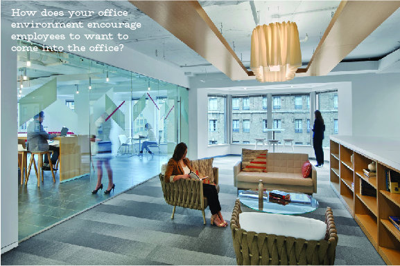
In one classic scene from Office Space, Gibbons is seated across from a management team, seeking to downsize the staff, “Looks like you’ve been missing quite a bit of work lately,” one of them states to Gibbons who has been less than motivated in the office lately. Gibbons replies, “Well, I wouldn’t say I’ve been MISSING it Bob.” This speaks directly to the essence of what current designers are trying to overcome by creating personalized workspaces and designing around technology in the process. How does your office environment encourage employees to want to come into the office?
Gone are the days, for instance, where large desktop computers were on every employee’s desk, therefore tying that person to the desk eight hours a day, five days a week. One Wall Street Journal article showcasing the best and worst office designs explored the role of technology and cost on office space, and Janet Pogue McLaurin, principal of Gensler, stated the obvious driver of the flexible and user/role-specific office space movement was due to the size and shape of changing technology and its influence in the commercial office space, “Technology [has] become more mobile, allowing employees to work from various places in the office, including conference and break rooms.”
Today, with the advent of micro and smart devices, VPN and “the cloud,” technology follows the person. “People used to think about their personal workspace as their individual desk. And now people realize the entire building or campus is their workplace. And so choice and autonomy and having control over when and where you work is a key driver,” McLaurin said.
Upper management material
Why exactly is the relentless study of the modern-day employee so important? In large part because owners are becoming more sensitive to operational expenses, the toll of the pace of the workplace on the workforce, and the impact of the space on the employee. If not approached in the most data-driven way, organizations can suffer the consequences ranging from increased costs, decreased brand awareness, lower morale, a decline in productivity, etc. This strategy — or lack of one — doesn’t exactly sound like one that produces happy, healthy employees who will strive for increased roles and the responsibilities in the organization.
“It’s about designing space that accommodates the people that needs to use them and giving them the comfort level to succeed,” stated Jodi Williams, associate vice president at CallisonRTKL. “Attracting and retaining talent and making [the space] the most attractive for their employees is crucial. Making it a productive environment without barriers to work and is supportive of the employees’ requirements is the only effective way.”
This is particularly true as most offices need to comfortably accommodate multi-generations of the workforce — from Millennials to Baby Boomers — and allow for their very different working styles. How Millennials engage and use a space, for instance, is very different from how Boomers use the same space. Technology is one key reason.
Multigenerational design speaks to the core value for designing for inclusion — physical and mental abilities, ages and more. “We’re seeing Boomers struggle with technology and device agnostic technology, but they can adapt quickly.”
Therefore, the workspace needs to have the infrastructure to support bandwidth to accommodate all users for all devices and for how each generational worker uses them. This includes a lot more smaller spaces to accommodate video and new technology, such as a quick one-on-one video call.
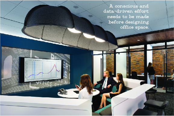
According to Williams, “The traditional open model doesn’t support this. Whether it’s a furniture solution or a small room or enclave to support the lack of visual and acoustic distractions,” a conscious and data-driven effort needs to be made before designing office space.
Don’t care
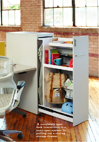
Unlike Gibbons, who insists, “It’s not that I’m lazy, it’s that I just don’t care,” most employees do care about the work they do, the environment they work in, the impact they have, the people they work with, and the employer they work for. One recent client CallisonRTKL worked with, American Insurance Association (AIA), witnessed firsthand the benefits of adapting to a blended, flexible, functional workspace when they transitioned entirely from closed office space. By using furniture systems including Knoll’s Anchor™, employees now have an extremely customizable and modular office environment. The level of privacy and collaboration an employee chooses is personal to them and can vary at any time of day. A completely open desk transitions to a semi-open system by pulling out a sliding storage drawer.
Choosing your friends (and your office space) wisely
When NC REALTORS® underwent an extensive renovation of its Greensboro Headquarters location, the design and leadership staff didn’t jump in feet first. Extensive time was spent surveying the staff, exploring adjacencies, and identifying elements that were required for staff to perform their best. Careful consideration was given to opening certain areas up to allow for infiltration of natural light into hallways across open areas, for instance. Various wall types were explored to optimize collaboration, such as glass walls for office suites. Today, the space mimics current design trends in the industry, providing a mix of open, collaborative spaces and closed offices with some communal public and traditional areas.
Ultimately, much like Gibbons needed to choose his friends wisely in Office Space, organizations need to choose their design teams, design approach, and furniture systems wisely — focusing on what and whom works best to achieve their ultimate goals — since office space is no longer one-size-fits-all.

